About the Project
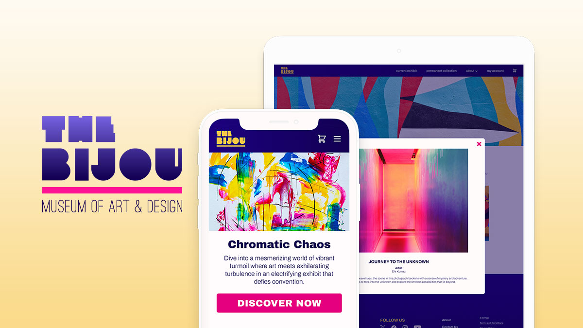
Working towards Google UX Design certification, I’ve crafted a mobile app and responsive website as a playground for mastering the fundamentals of user experience design. With a focus on simplicity and accessibility, this project showcases my exploration of ideation, user research, wireframing, and prototyping. I aim to not only demonstrate my proficiency in UX design but also to develop a deep understanding of user-centric design principles, which are essential for creating intuitive and engaging digital experiences.
The Product
The Bijou is a contemporary art museum. The typical visitor age range is 18-65. Most visitors are college students, art professionals, and older, affluent retirees. The Bijou strives to curate exciting, groundbreaking exhibits.
The Problem
Museum visitors need to be able to purchase exhibit tickets online to avoid long lines at the door. Many art museum websites are clunky and difficult to navigate.
The Solution
This mobile app and responsive site will provide a user-friendly ticket purchase experience. It will also allow users to learn about The Bijou’s current exhibit and prepare for their visit.
My Role
Lead UX/UI Designer
My Responsibilities
- ideation
- competitive audit
- user research
- storyboarding
- wireframes
- low fidelity prototyping
- high fidelity prototyping
Understanding the User
I wanted to understand common challenges people face when planning to attend a museum event. I also wanted to identify frustrations people experience while purchasing event tickets online.
Since The Bijou is a fictional museum, I interviewed family and friends who would most likely visit a contemporary art museum.
To determine ideal interview candidates, I looked at the target demographics of a local art museum similar to The Bjiou. Based on this data, I determined that the best participants would be local residents ages 18-80 who attend museum events at least twice a year.
Interview Questions
- How often do you attend ticketed events at art museums? What is your motivation for attending?
- Are there any challenges you face during the ticket purchase process? How do these challenges make you feel?
- How do you think these challenges could be resolved?
Pain Points
During the user interview process, I discovered a variety of challenges people face when purchasing tickets online and attending events. For my initial round of mobile app development, I chose to focus on the following issues:
- inability to wait in long lines to purchase tickets at the door due to physical limitations
- saving purchased tickets in the app to avoid misplacing printed tickets

“I love socializing with other retirees while learning about art. I’m always looking forward to new exhibits.”
Persona: Naomi Snyder
Naomi is a retired snowbird who lives in St. Petersburg, FL, during the winter to escape the cold Midwest winters. She is an affluent museum goer who loves to attend special events and meet other art enthusiasts. She enjoys taking her grandchildren to The Bijou when they are visiting. Naomi dislikes waiting in long lines and finds it difficult to hear in crowded spaces.
Age: 72
Education: masters degree
Hometown: St. Petersburg, FL
Family: married, 3 adult children, 4 grandchildren
Occupation: retired teacher
Goals
- stay up-to-date on museum news
- regularly attend temporary exhibits
- socialize with other art enthusiasts
Frustrations
- long lines and wait times
- difficulty keeping track of physical tickets
User Journey Map
Persona: Naomi Snyder
Goals: Browse events to attend, purchase event tickets, bypass the museum’s ticket counter and go directly to the exhibit entrance.
| Action | Task List | Feeling | Improvement Opportunities |
|---|---|---|---|
| Find an event to attend |
|
confused, unsure | Make it easy to find events and learn more about them.
Make pricing clear. |
| Select tickets |
|
anxious, confident, surprised, annoyed | Make it easy to adjust ticket quantities and to add or remove items from cart. |
| Payment |
|
satisfied, relieved, frustrated, regretful | Confirm user wants to purchase and allow user to review items once more before final purchase. |
| Enter museum |
|
happy, relieved, frustrated | Make it easy to access tickets in app when needed.
Provide an alternate way for museum employee to look up purchased tickets if app isn’t working. |
Competitive Audit
Objective
To create the best user experience for The Bijou’s visitors, I audited several of the museum’s direct and indirect competitors to see what their apps and websites are doing well and where improvements could be made.
Research Questions
Is the competitor appealing to its intended audience?
How does the app/website look, feel, and function?
Is the app/website easy for the user to navigate and complete tasks?
Procedure
I reviewed the following aspects of each museum’s app and/or website design:
- target audience
- first impressions
- user interaction
- visual design
- content
Below are the results from one direct competitor and one indirect competitor.
Direct Competitor
Tampa Museum of Art
The Tampa Museum of Art features a diverse collection of modern and contemporary art. It regularly hosts rotating exhibitions and offers educational programs and workshops for visitors of all ages. The museum’s target audience is contemporary and classical art enthusiasts.
First Impressions
Good: Overall, the desktop and mobile website experiences are OK. The site is responsive, and info is easy to find and read.
Room for improvement: The site is text heavy and doesn’t have enough visuals to grab a user’s attention. Images are slow to load.
Features
Good: Users are able to purchase tickets and register for classes online, as well as view collections.
Room for improvement: Some pages are slow to load or don’t load at all. Many internal links open in new windows.
Accessibility
Good: The menu is compatible with screen readers.
Room for improvement: It would be more inclusive to offer the site’s content in multiple languages. A high contrast text option would benefit users with visual impairments.
User Flow
Good: It’s easy to find key info, and info is up to date.
Navigation
Good: The site is easy to navigate, and it’s clear what is clickable.
Room for improvement: It takes too many clicks to buy tickets. Key info is hidden under excessive menu options.
Visual Design
Good: The color scheme is clear although minimal.
Room for improvement: The site is so extremely minimalistic that it lacks a definitive style. The site also has some layout issues.
Content
Good: Copy is clear and concise.
Room for improvement: Copy could be more engaging.
Indirect Competitor
The Dalí Museum
The Dalí Museum, located in St. Petersburg, Florida, houses the world’s largest collection of Dalí’s artwork. The museum features an architecturally innovative space and offers interactive exhibits. Its target audience is Dalí and surrealism art enthusiasts.
First Impressions
Good: Both the desktop site and mobile app experiences are visually appealing, responsive, easy to navigate and load quickly.
Features
Outstanding: Users are able to purchase tickets and view exhibits online. The app provides an interactive map, augmented reality and self-guided tours.
Accessibility
Good: The menu is compatible with screen readers. The app is available in multiple languages and allows users to adjust font size.
Room for improvement: The website could be more inclusive by offering its content in multiple languages and providing a high contrast text option for the visually impaired.
User Flow
Good: It’s easy to find key info, the info is up-to-date, and a clear hierarchy exists.
Navigation
Good: The site is extremely easy to navigate, and it’s clear which items are clickable.
Visual Design
Good: The site and app use colors, fonts and images well.
Content
Good: Descriptions are short and clear. The copy is engaging and makes me excited to visit.
Key Takeaways
The best apps/websites offer plenty of useful features, such as online exhibits, an interactive map, AR, a chat bot, and self guided tours. These features should be easy to navigate with plenty of accessibility options. Branding should be well integrated into the design.
Avoid overly complicated navigation. The user flow should be streamlined as much as possible. Information should be presented clearly.
User Flow
My goal with this user flow was to outline an efficient process (aka the “happy path”) for purchasing a ticket via The Bijou’s mobile app.

User Flow

User Flow
Storyboards
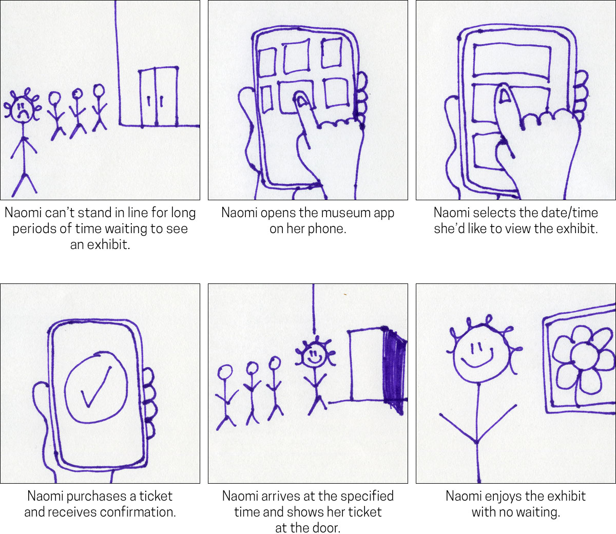
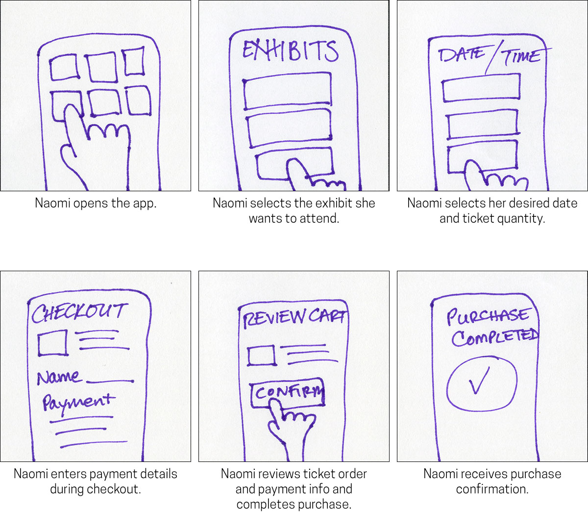
I created two sets of storyboards. The big-picture storyboards focus on how the mobile app will benefit user. The close-up storyboards focus on the actual app and how it will work.
Big Picture Storyboards
Scenario: Naomi wants to attend an art museum exhibit, but she is unable to wait in line for long periods of time.
Close-Up Storyboards
Scenario: Naomi uses a mobile app to purchase exhibit tickets.
Information Architecture
Below is the sitemap I created to help me plan each page needed for the mobile app and organize the app structure.
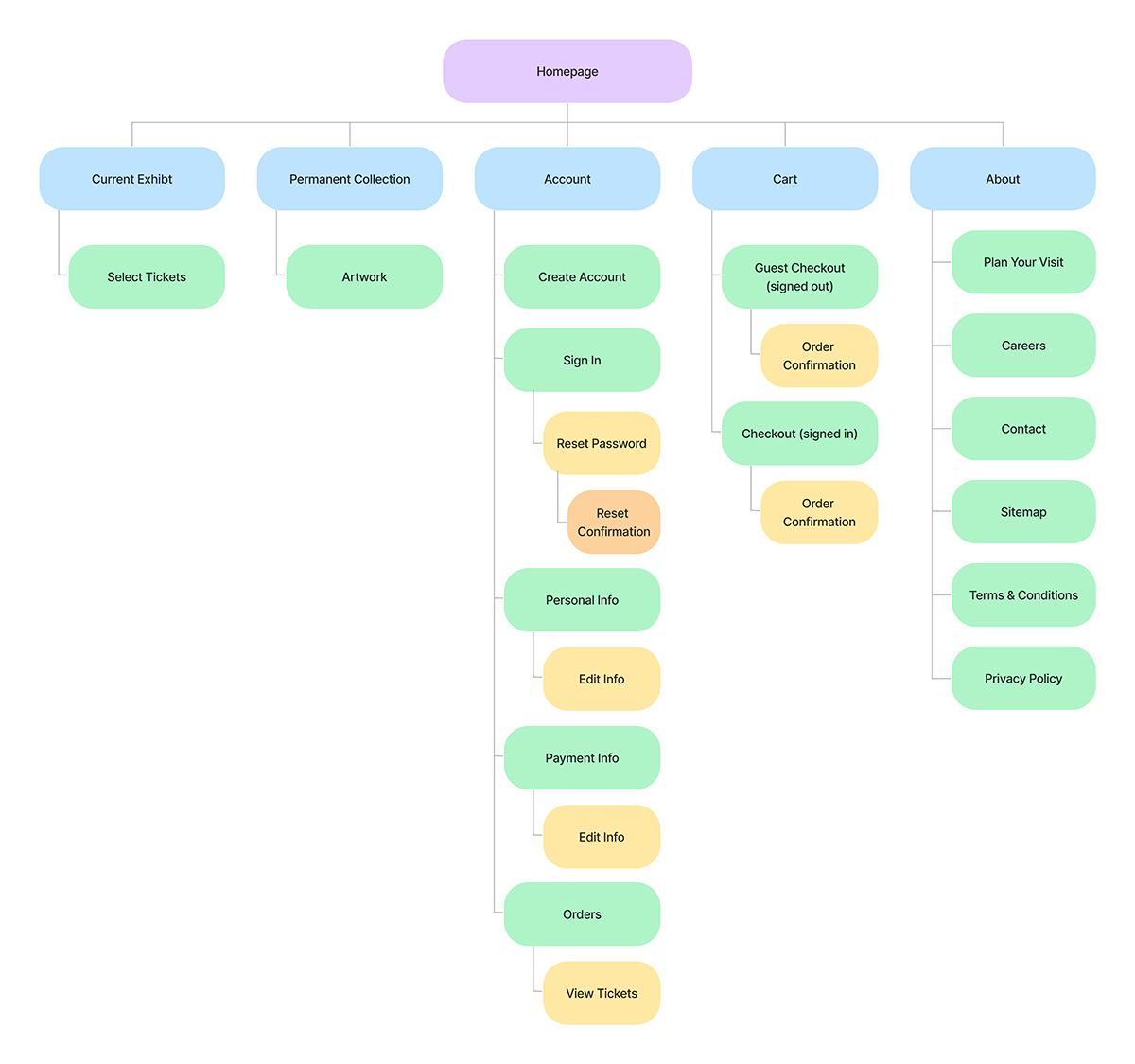
Sitemap
Paper Wireframes
I created some rough layouts for the app’s homepage to quickly get some ideas down on paper. I starred the features from each sketch that I thought would be most effective and sketched a revised layout.

Paper Wireframes – Homepage
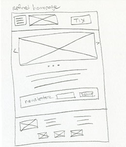
Paper Wireframes – Refined Homepage
Low Fidelity Mobile Prototype
After completing some rough sketches, I created the wireframes for the app’s happy path. I focused on the key components that would get the user from the homepage to completing a purchase.
Check out the interactive low fi mobile prototype below!
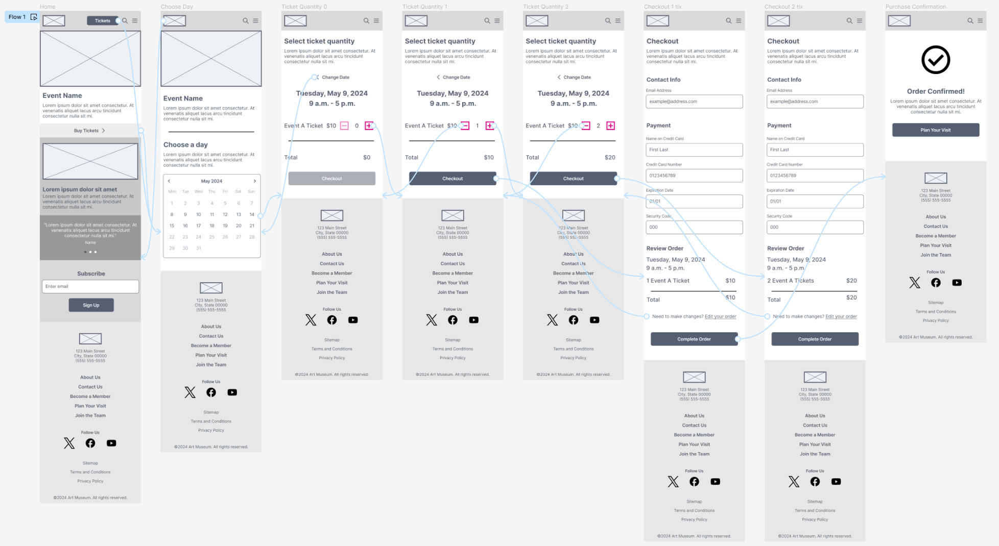
Low Fidelity Mobile Prototype
Usability Study
After completing the initial low fidelity prototype, I conducted an unmoderated usability study to determine what was working and what could be improved. The KPIs I tracked were the following:
- time on task: how much time users spend ordering tickets
- conversion rates: how many users successfully complete an order
- user error rates: how often users encounter issues while trying to complete an order
Affinity Diagram
After completing the usability study, I organized the feedback using an affinity diagram.
Key Takeaway
Based on user feedback, I realized that the app needed a shopping cart so users can review and edit orders.
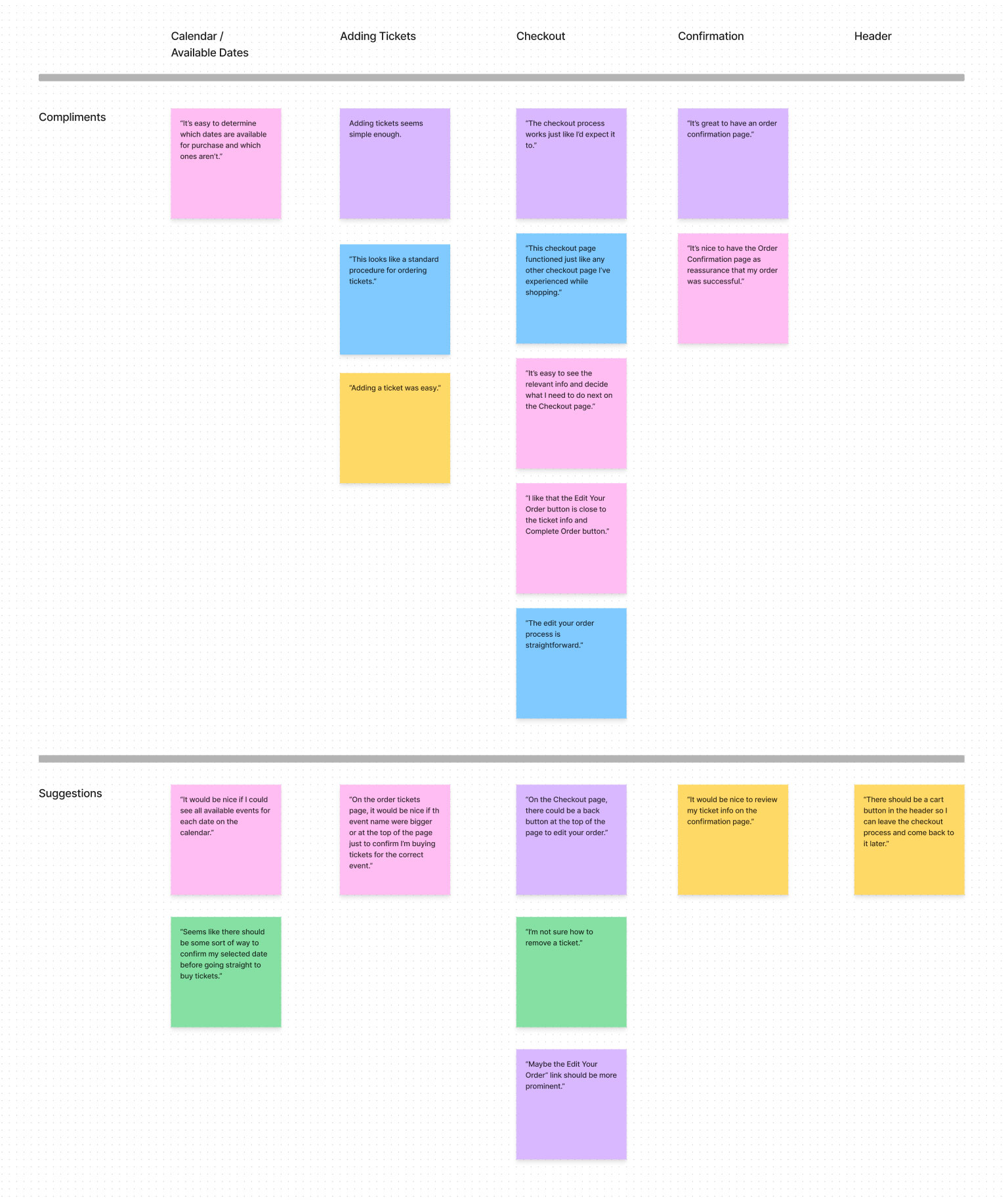
Affinity Diagram
Revised Low Fidelity Mobile Prototype
Based on the affinity diagram, I determined which feedback was most critical to creating a successful user experience and revised my low fidelity prototype.
Check out the revised low fi mobile prototype below!
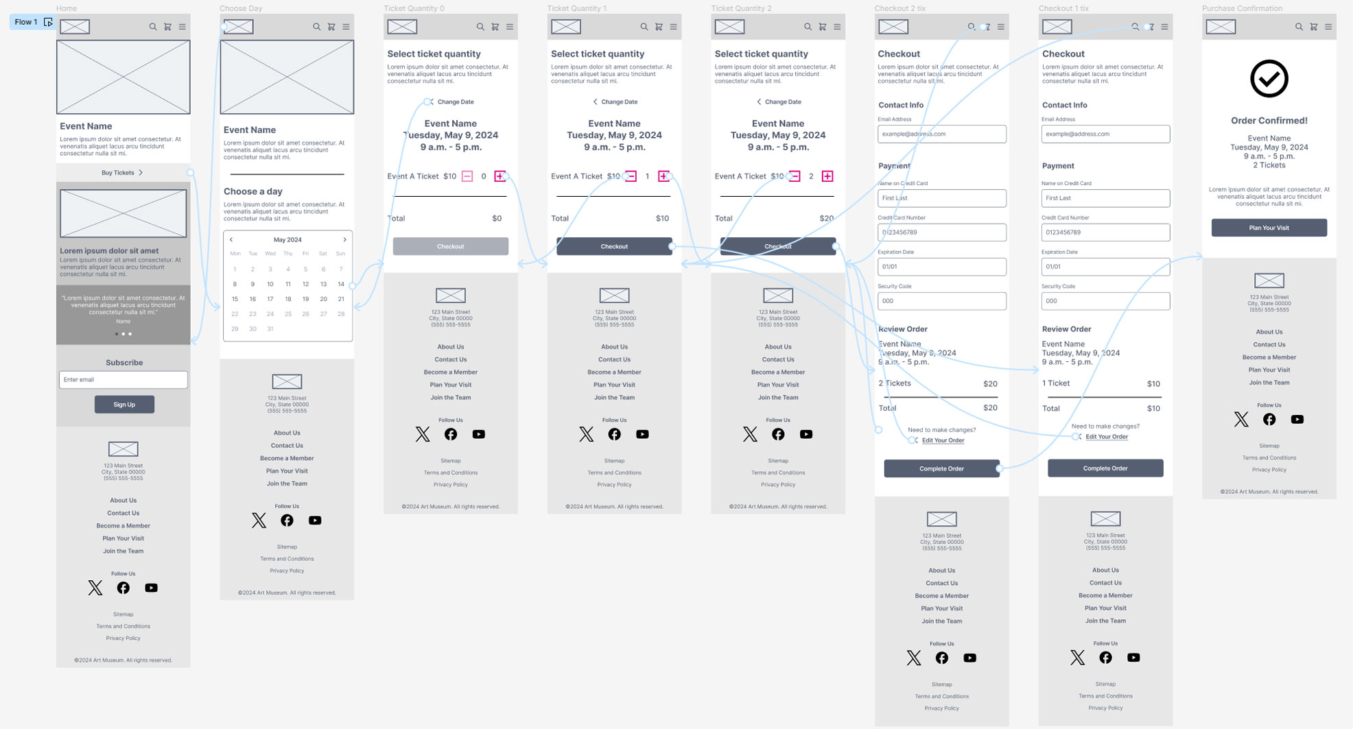
Revised Low Fidelity Mobile Prototype
Design System and Style Guide
After revising the low fidelity prototype, I needed to build the remaining pages, apply The Bijou’s branding to the pages, and create a design system.
I created a style guide for The Bijou as well as reusable components for the high fidelity prototype.
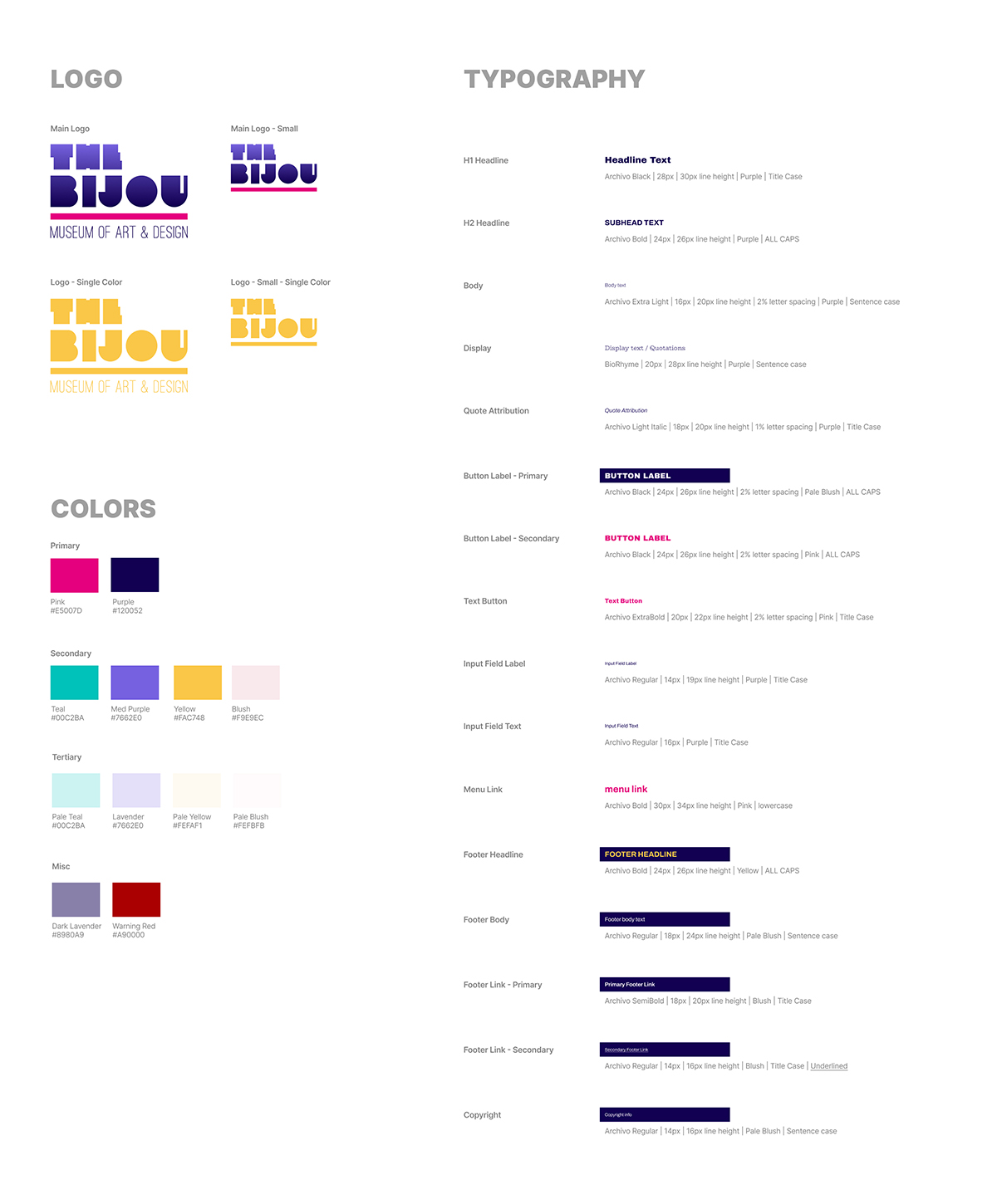
The Bijou’s Style Guide
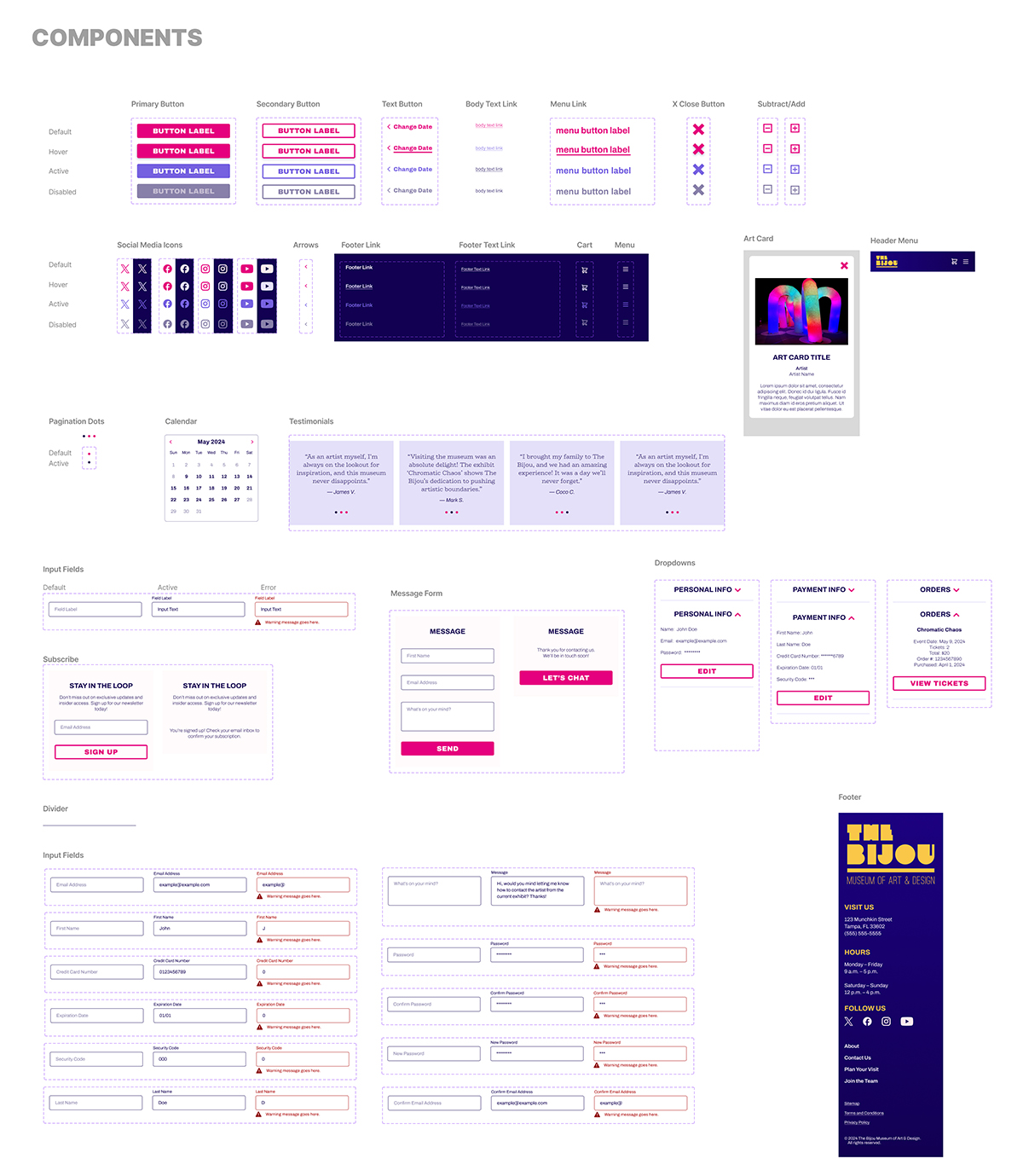
Component Sheet
Mobile High Fidelity Prototype
Completing the high fidelity prototype was my favorite part of the entire process. Nothing beats finally seeing the wireframes come to life!
I made sure that all color contrast ratios were at least WCAG AA compliant for accessibility.
At this point, the prototype is ready for hand off to the development team, followed by QA testing.
Check out the interactive mobile high fi prototype below!
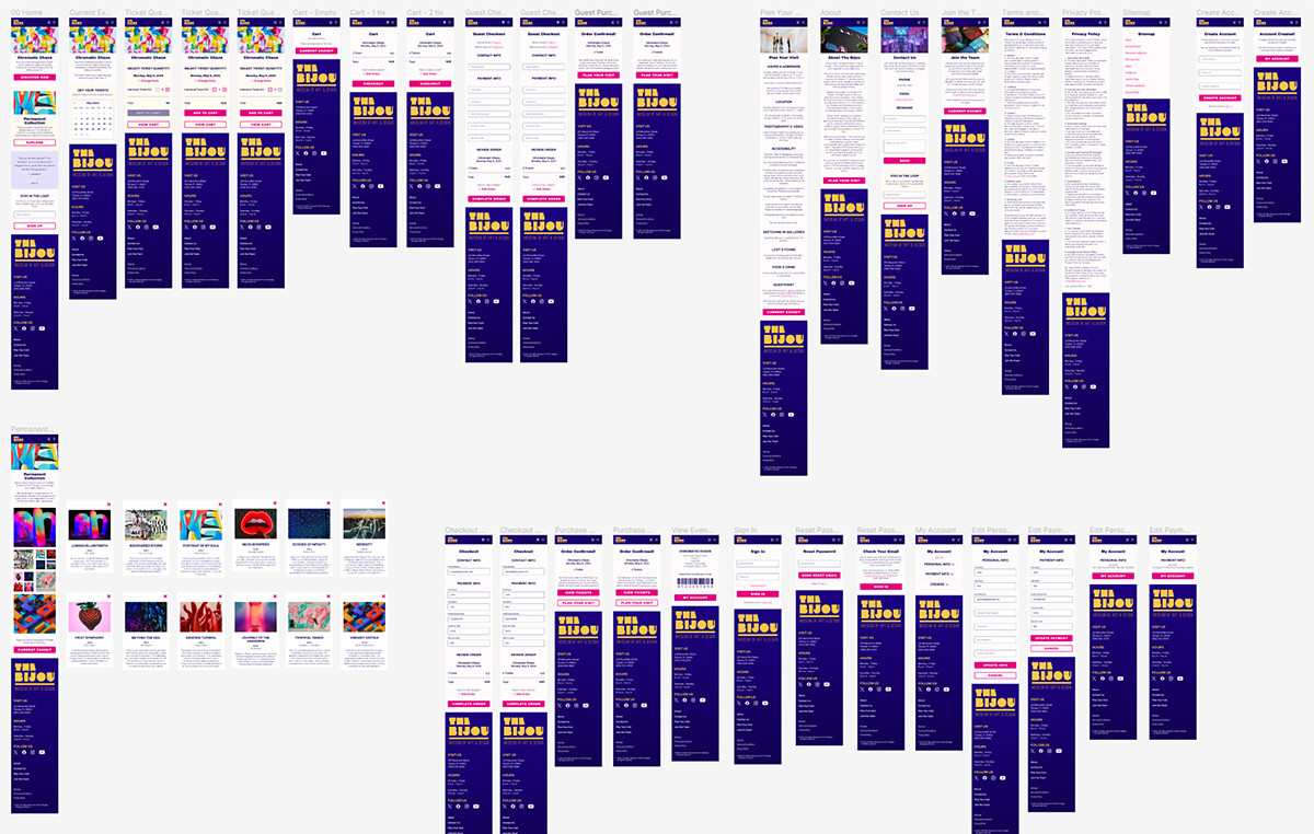
Mobile High Fidelity Prototype
Desktop High Fidelity Prototype
After completing the mobile prototype, I created a desktop version.
Check out the desktop high fi prototype below!
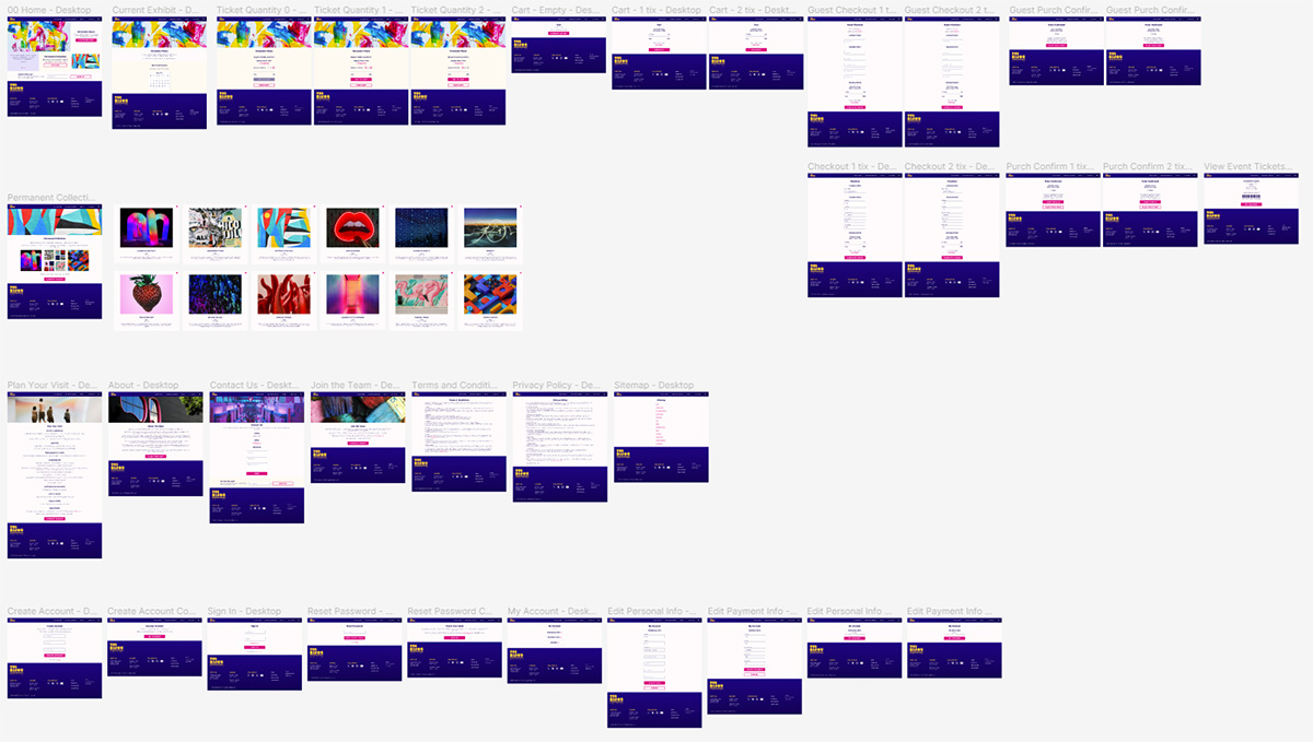
Desktop High Fidelity Prototype
Final Thoughts
Now that the first phase of The Bijou’s mobile app and responsive website are finished and ready to launch, I’d like to start a second iteration that focuses on accessibility improvements. I’d also like to add more features, such as an interactive map and a self guided tour of the current exhibit.

